Opposable Thumbs
Independent Agency
Independent Agency
All Rights Reserved
Opposable Thumbs
Currently working out of living rooms across India.
We’ll update our office address when the world’s a tad safer to live in.
We’ll update our office address when the world’s a tad safer to live in.
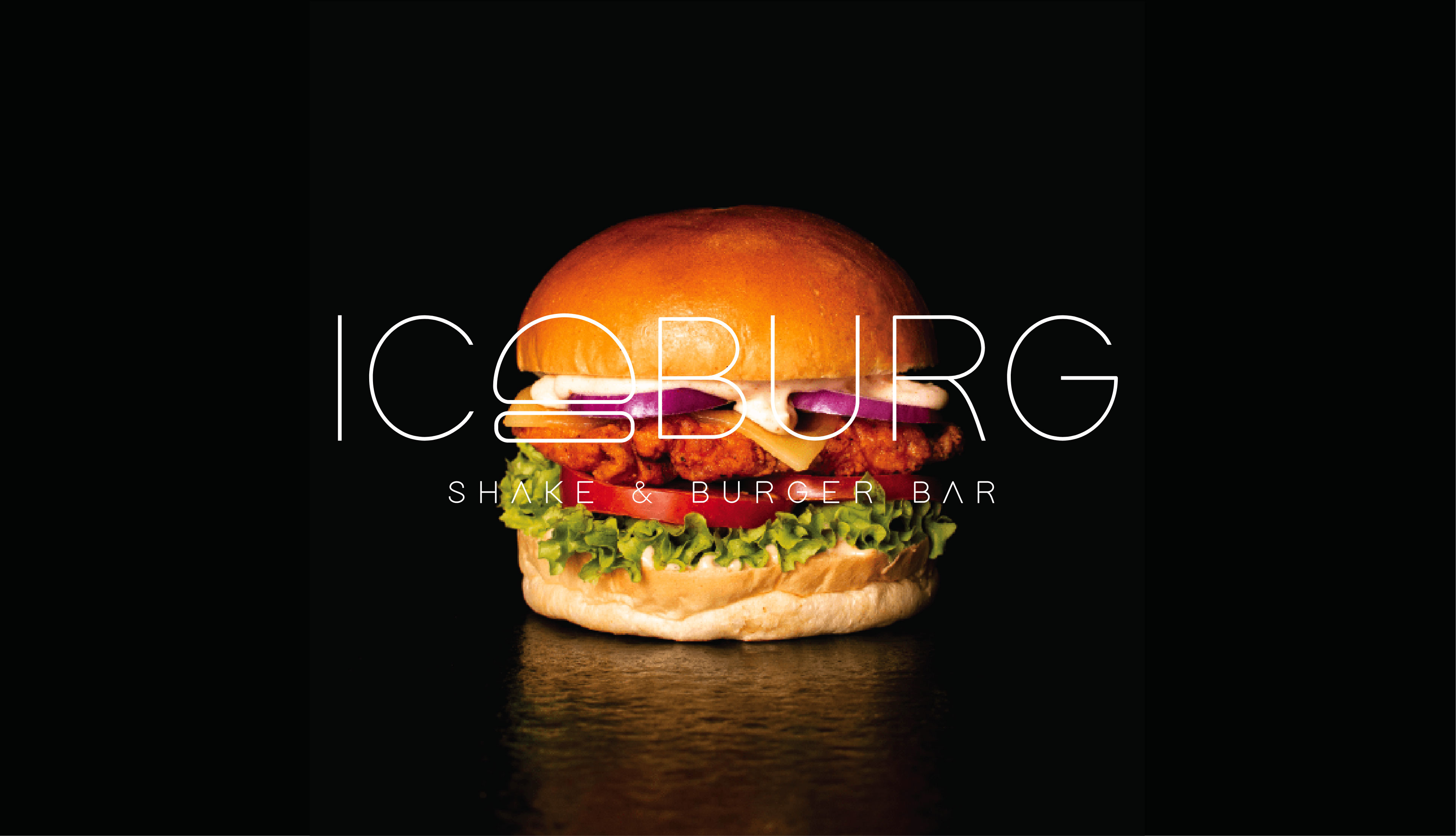
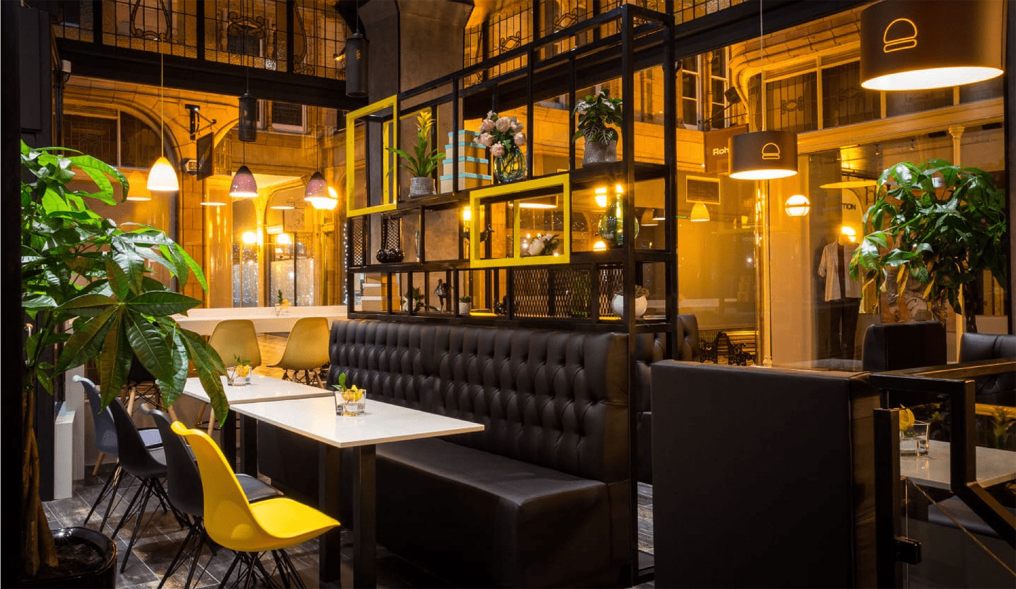
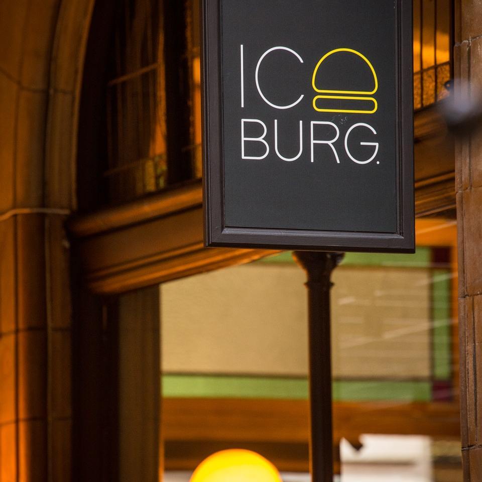
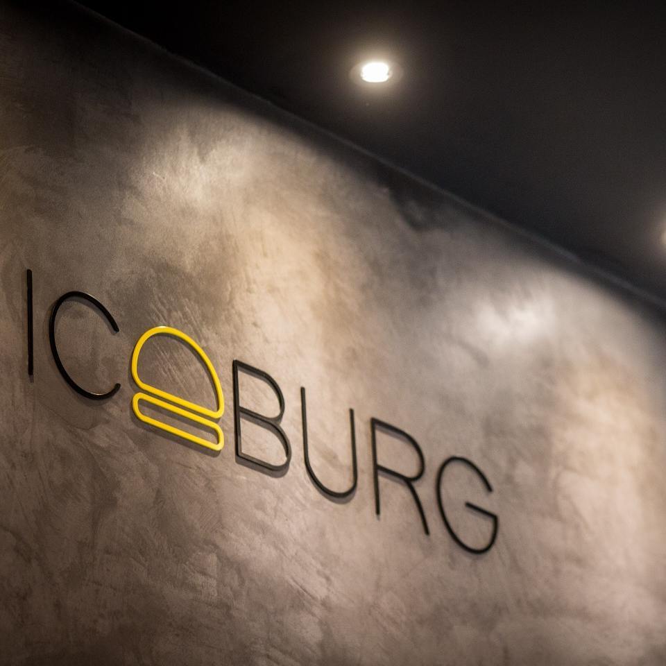
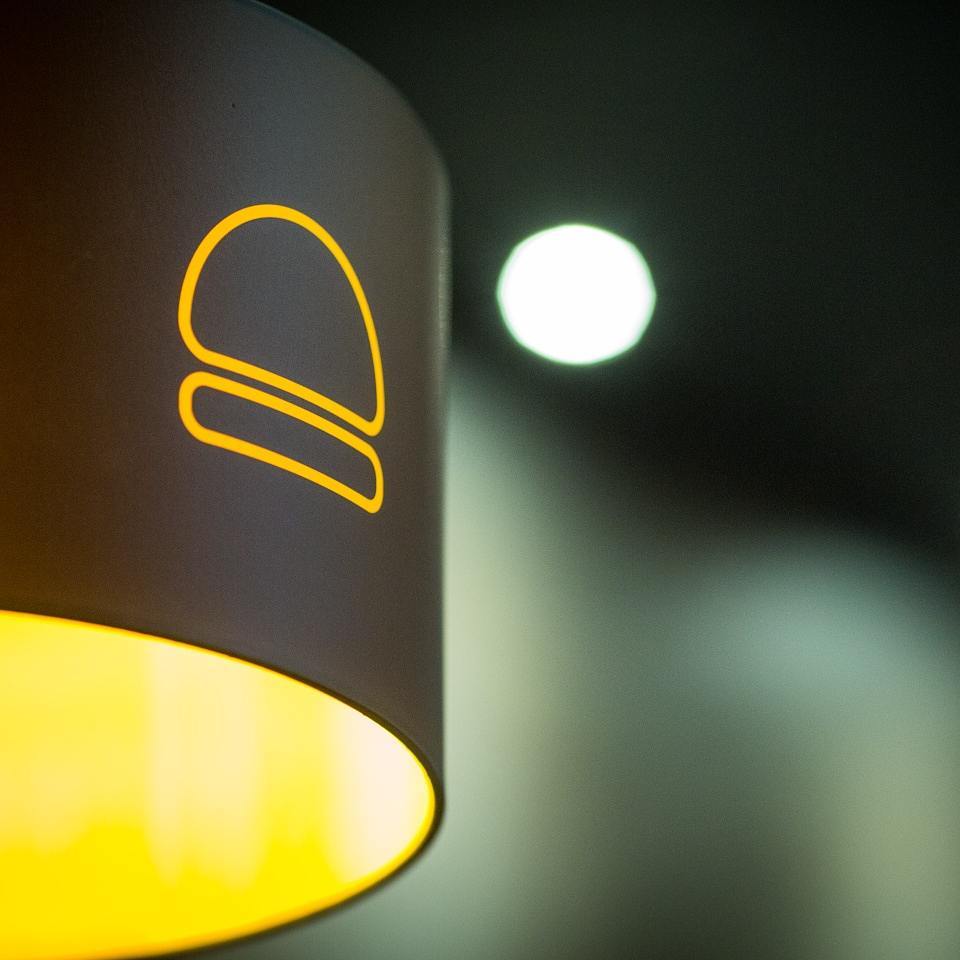
IceBurg
A UK-based gourmet burger and shake bar that draws in the young consumer with a refined palate.
The Brief 
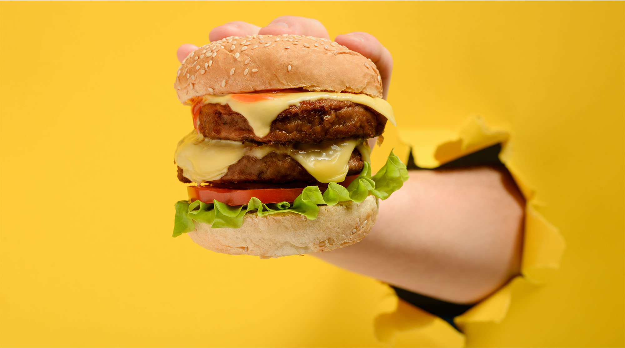
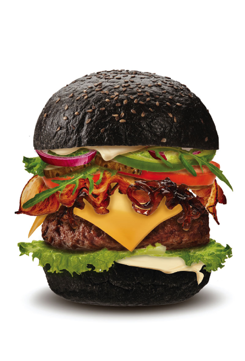
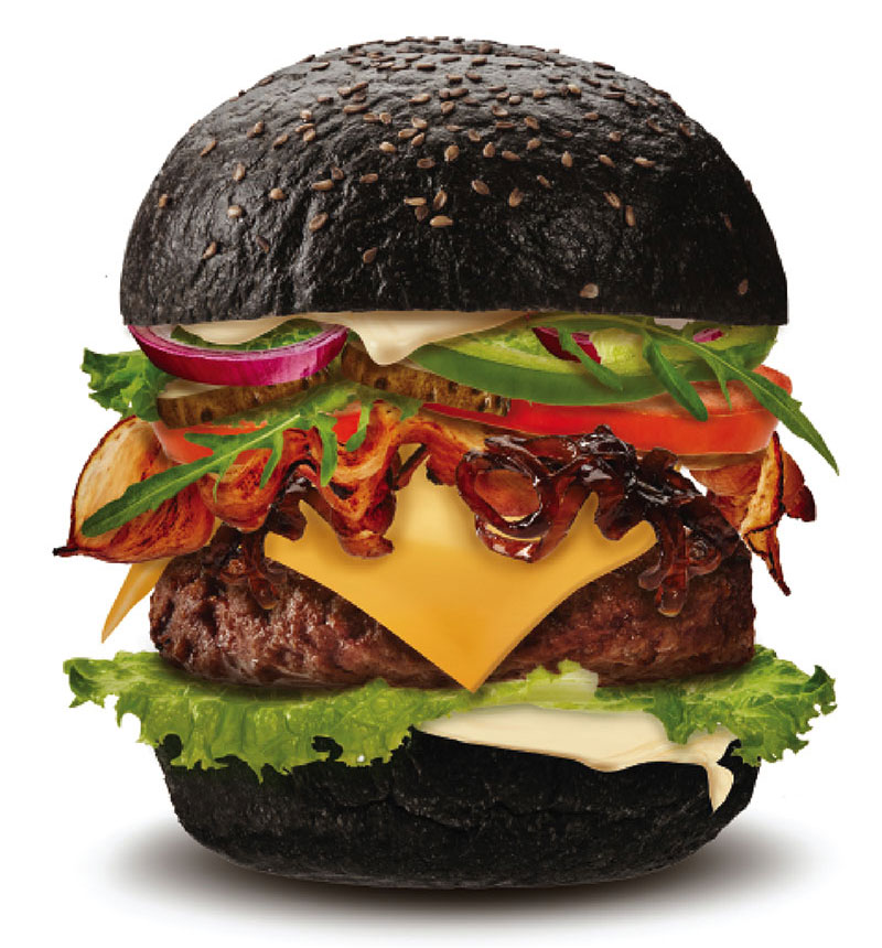
Gone are the days of assembly-line burgers. With consumers becoming increasingly conscious about what they eat, and craving for more artisanal choices, fast food has undergone a reinvention in the recent years. The humble burger has transformed into a gourmet indulgence, fueled even more by the drool-worthy imagery of social media. Riding on this trend of gourmet burgers, a UK-based company wanted to launch a chain of burger and shake bars. And that’s where we came in.
MOOD
- Young
- Appetizing
- Trendy
- Eye-catching
- Fun
Solution
From a name that summed up its intent in a direct, yet catchy, memorable way, to identity that reflected its brand persona, and packaging that was young and fun, we had to create everything from the scratch. We fused together the two core offerings of the brand to create the name and identity. And from there, we just had fun.

CAPTURING THE STORY
THOUGHTFUL BRANDING
PURPOSEFUL DESIGN
PACKAGING DEVELOPMENT
The idea
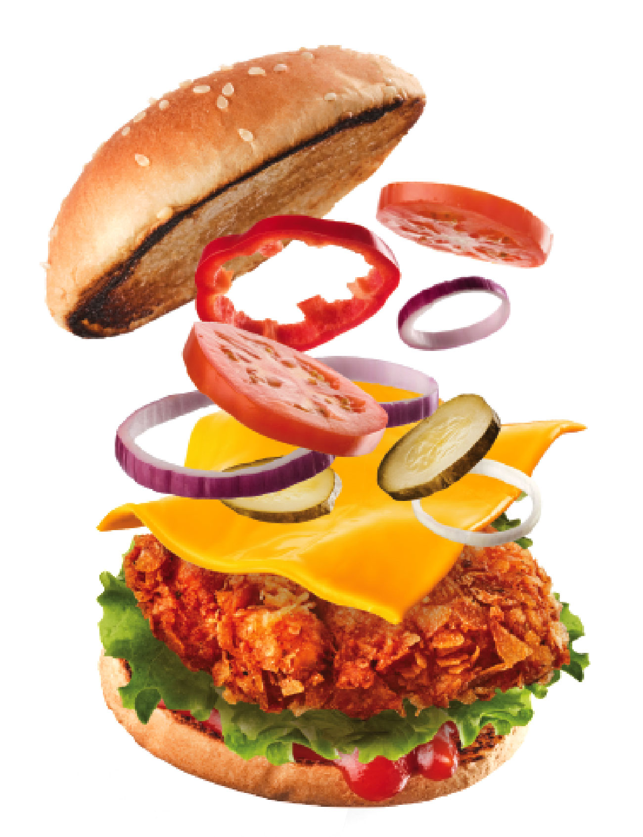
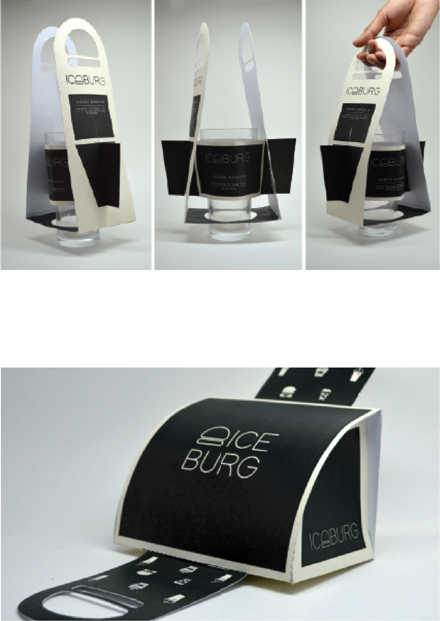
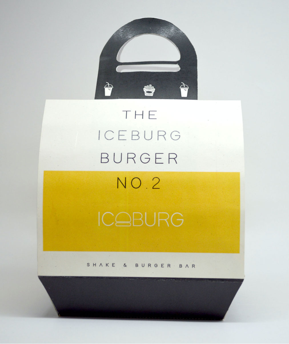
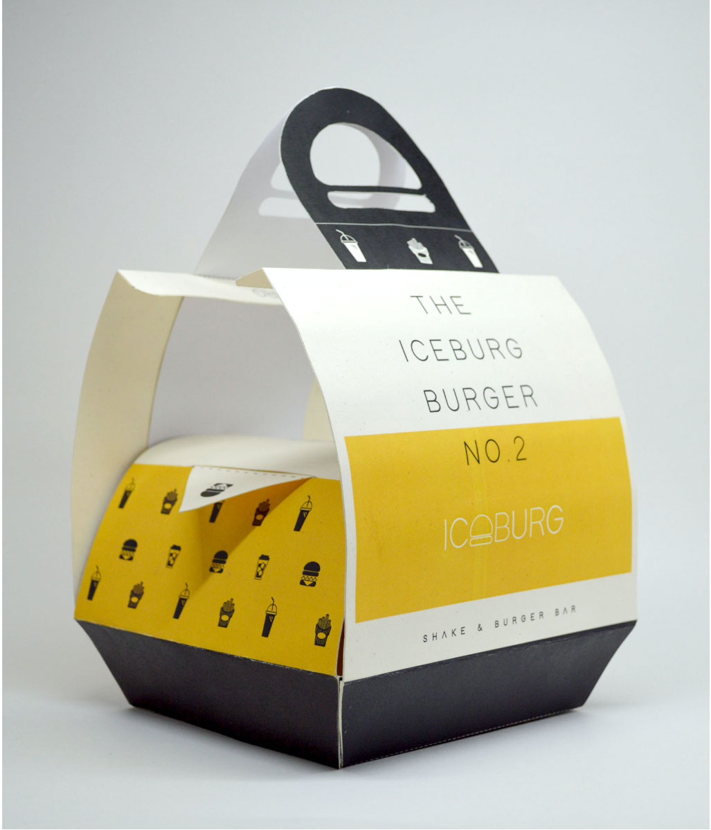
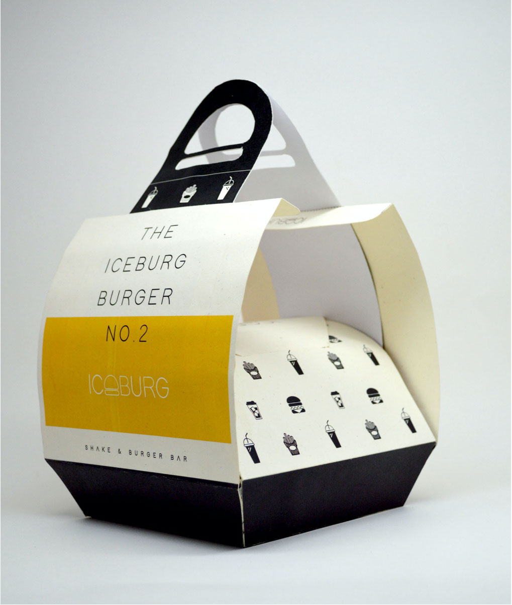
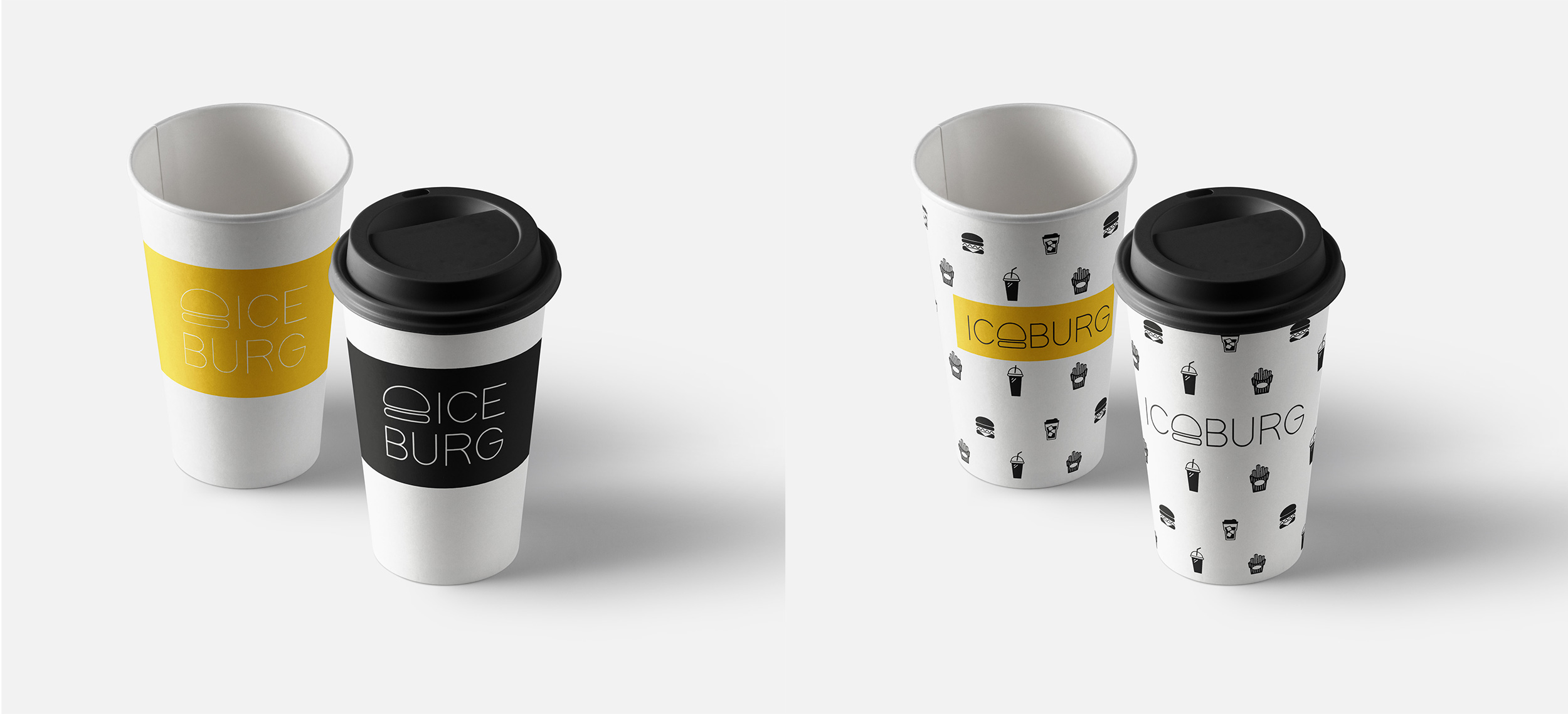
We let our imagination run wild as we experimented with packaging and came up with interesting forms. Using iconography, we enhanced the look and feel.
Explorations
After much research and prototyping, we came up with interesting shapes to make the packaging more tactile. On our packaging elements, we used a utilitarian graphic language to simplify choices, because a hungry mind cannot process too much information.
LOGO EXPLORATIONS
Colour story
We eat with our eyes first. And colours plays a big part in enticing us. Yellow is one of the most widely used colours in food branding because it is believed to whet people's appetites, making it more likely for them to enter the store and buy food.