Big Banyan
Premium Indian wines that needed to be reimagined as a brand, to communicate better with their consumer, the sophisticated wine drinker.
The Brief 

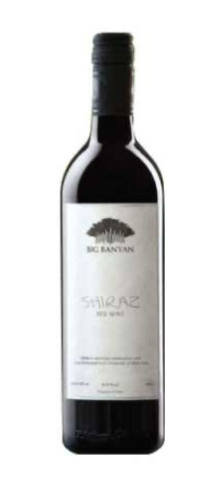
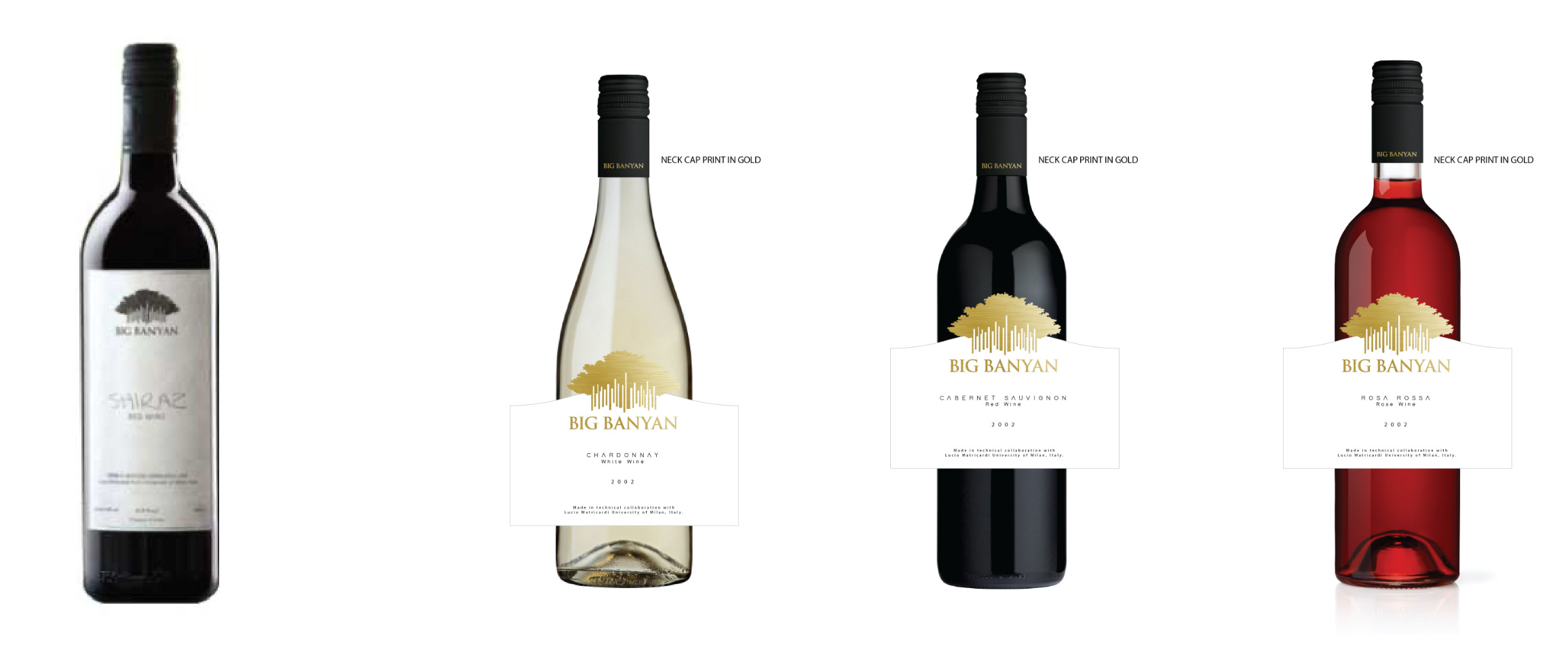
After over a decade of launching their wines, Big Banyan decided it was time for change. Their wines were well-loved, but recall was a problem. Their passion for winemaking was not clearly translating into the brand communication. The imagery of their packaging needed a contemporary touch too. They went to the consumers and heard what they had to say. And thus, was born an exercise of strengthening their positioning, their brand story and their packaging.
Solution 

Our conversations with the winemaker, the brand team and consumer research led us to discover key elements that made for an amazing brand story, and the problems it could solve. We decided to tell the tale of the terroir and their love for winemaking, bring alive the sophistication of the wines through new packaging, and keep brand recall at the forefront.
BIG BANYAN WINES
The Result 

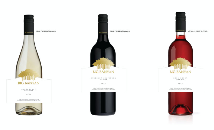
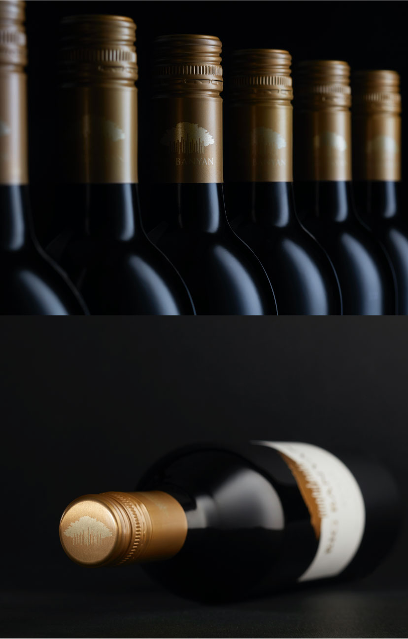
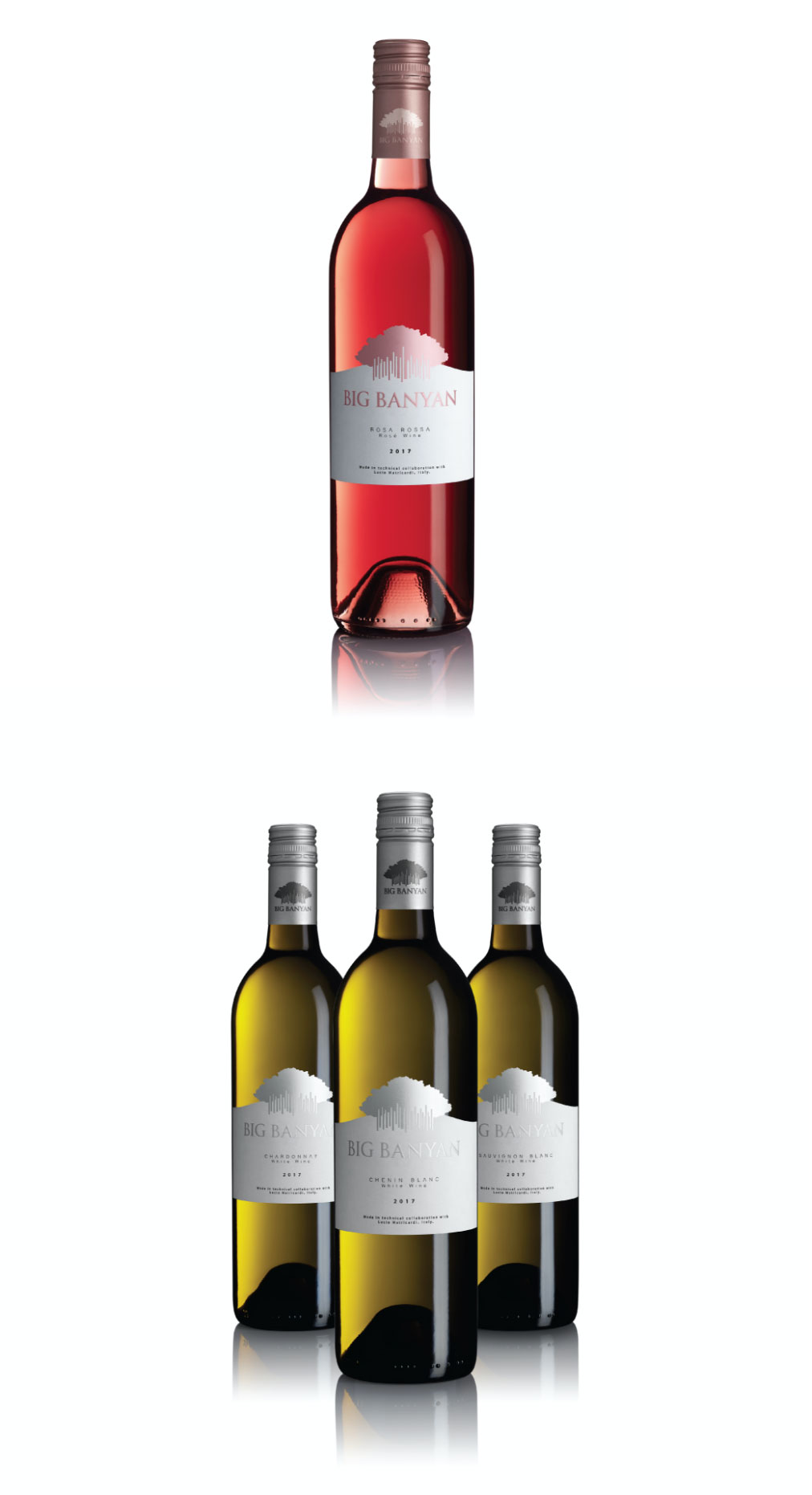
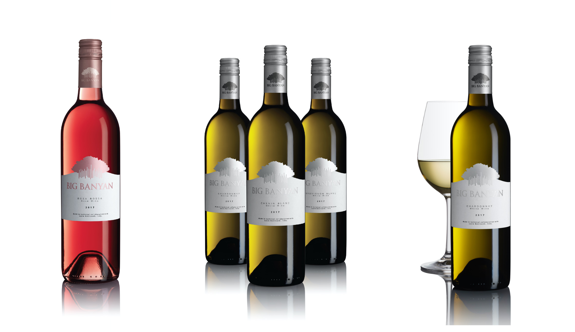
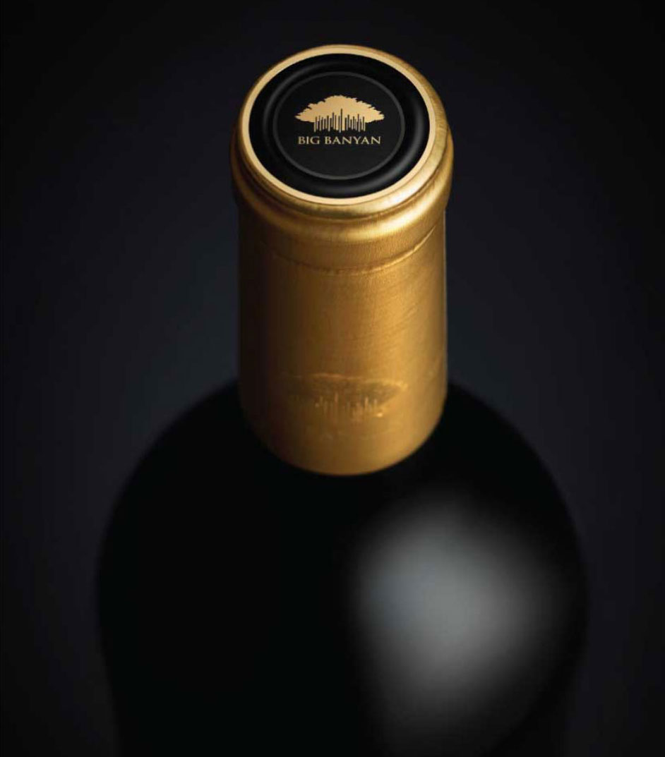
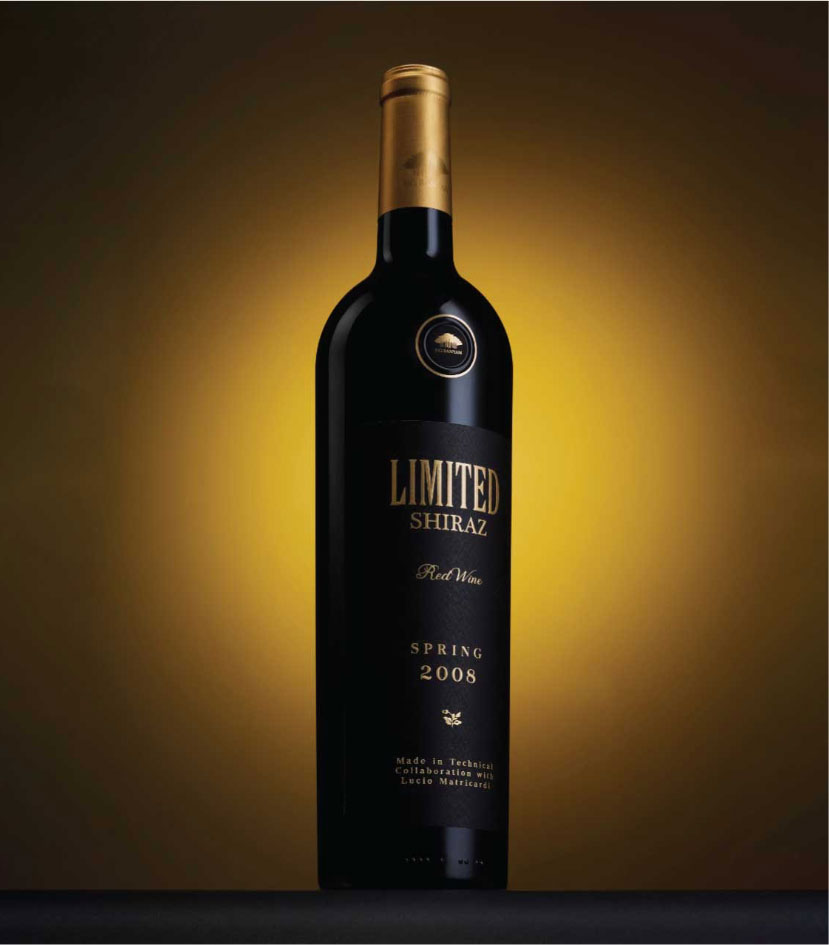
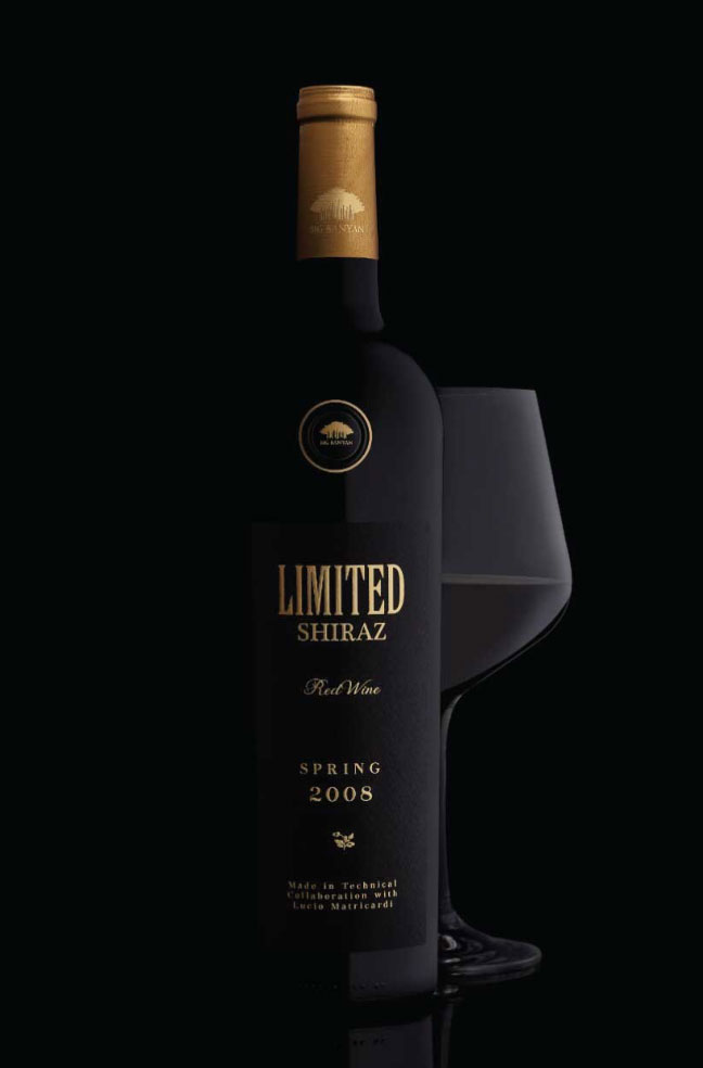
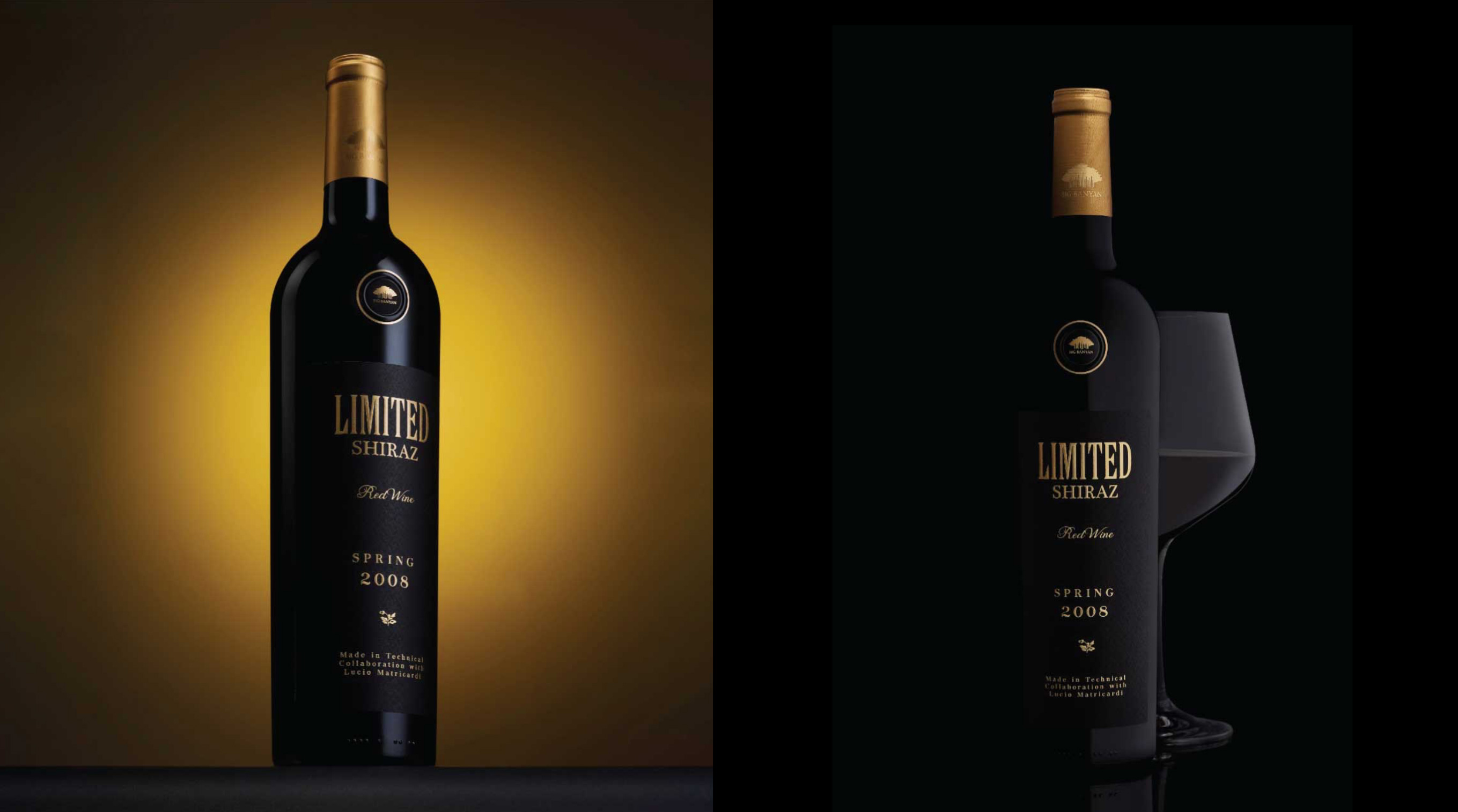
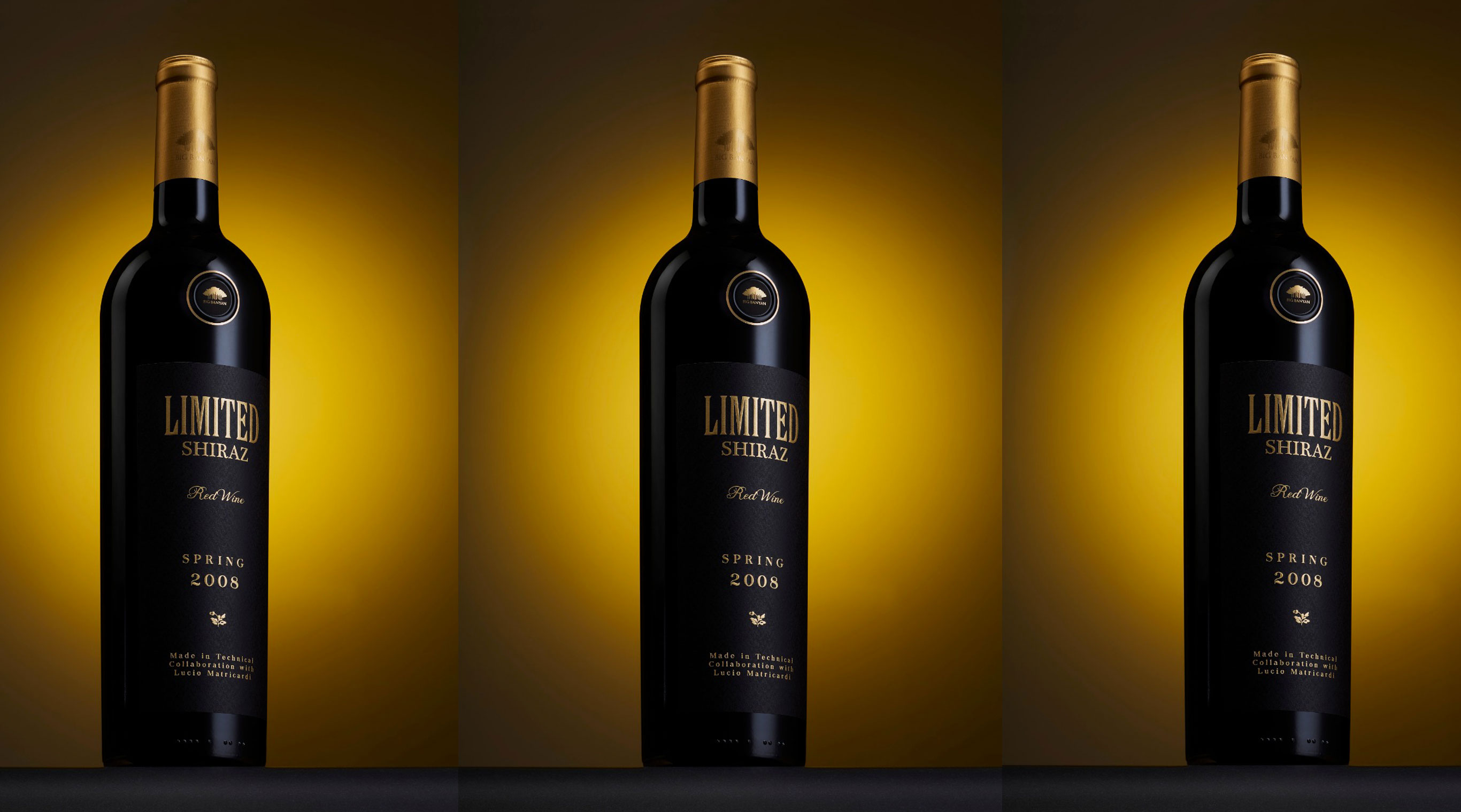
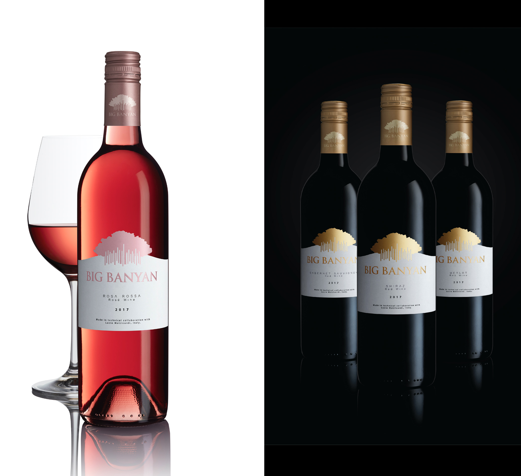
With the new packaging design, we brought the brand name front and center. Accents in gold, silver and rose gold differentiated the varietals and also added elegance to the bottles.
INDIA INSPIRED
INTERNATIONAL APPEAL
FLAVOUR FOCUSED
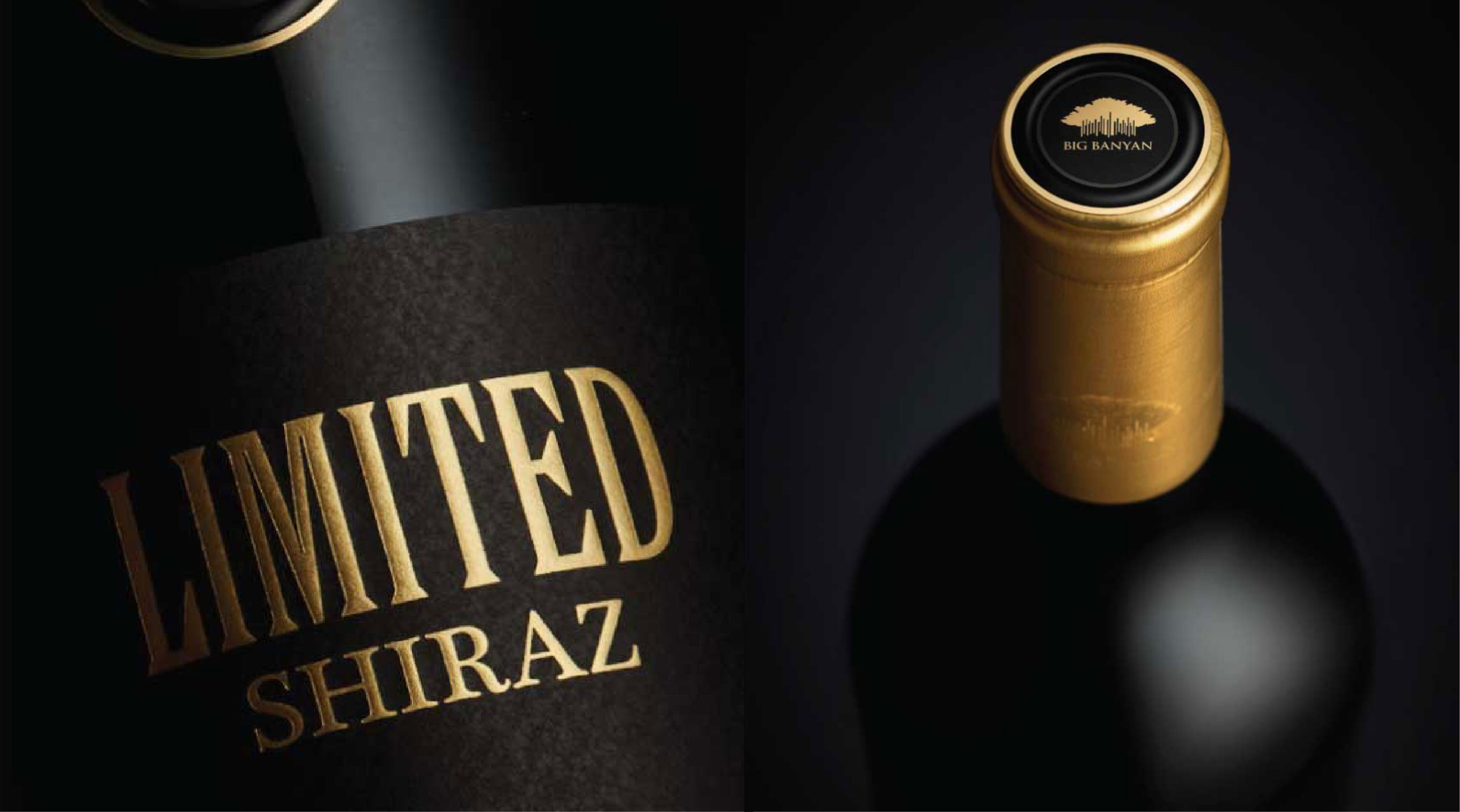
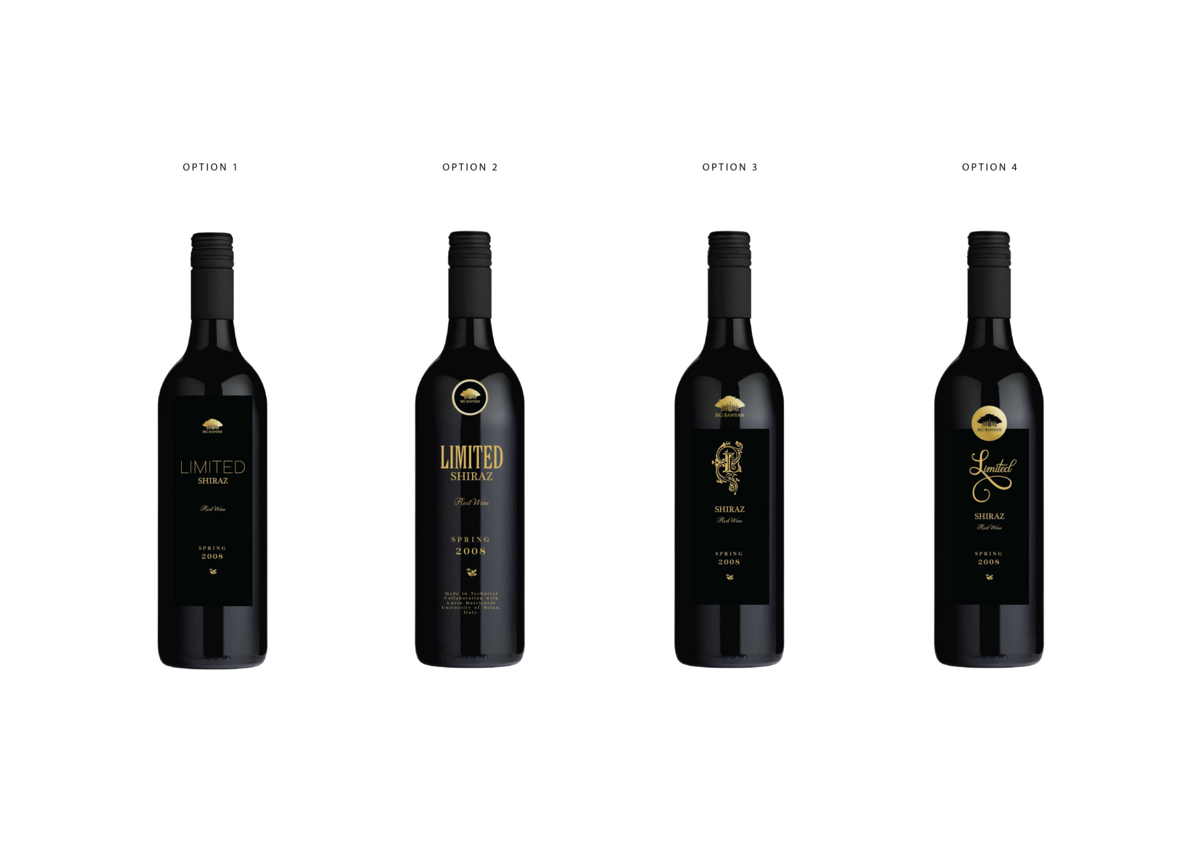
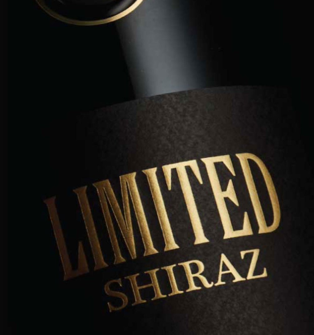
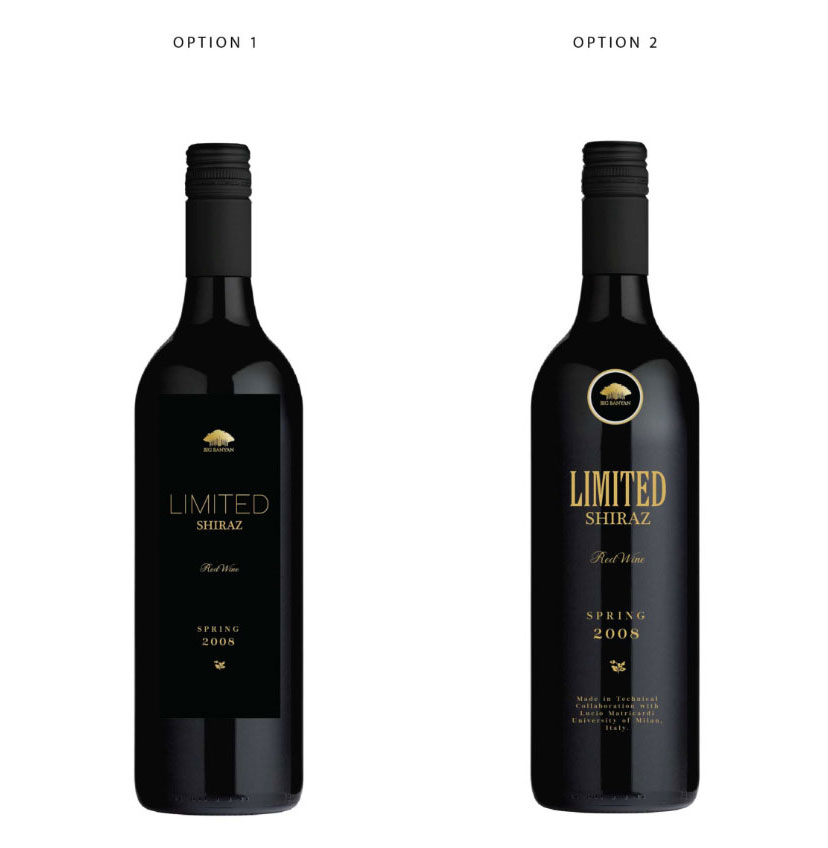
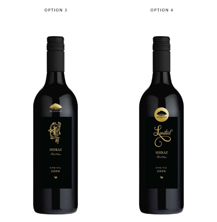
LIMITED SHIRAZ
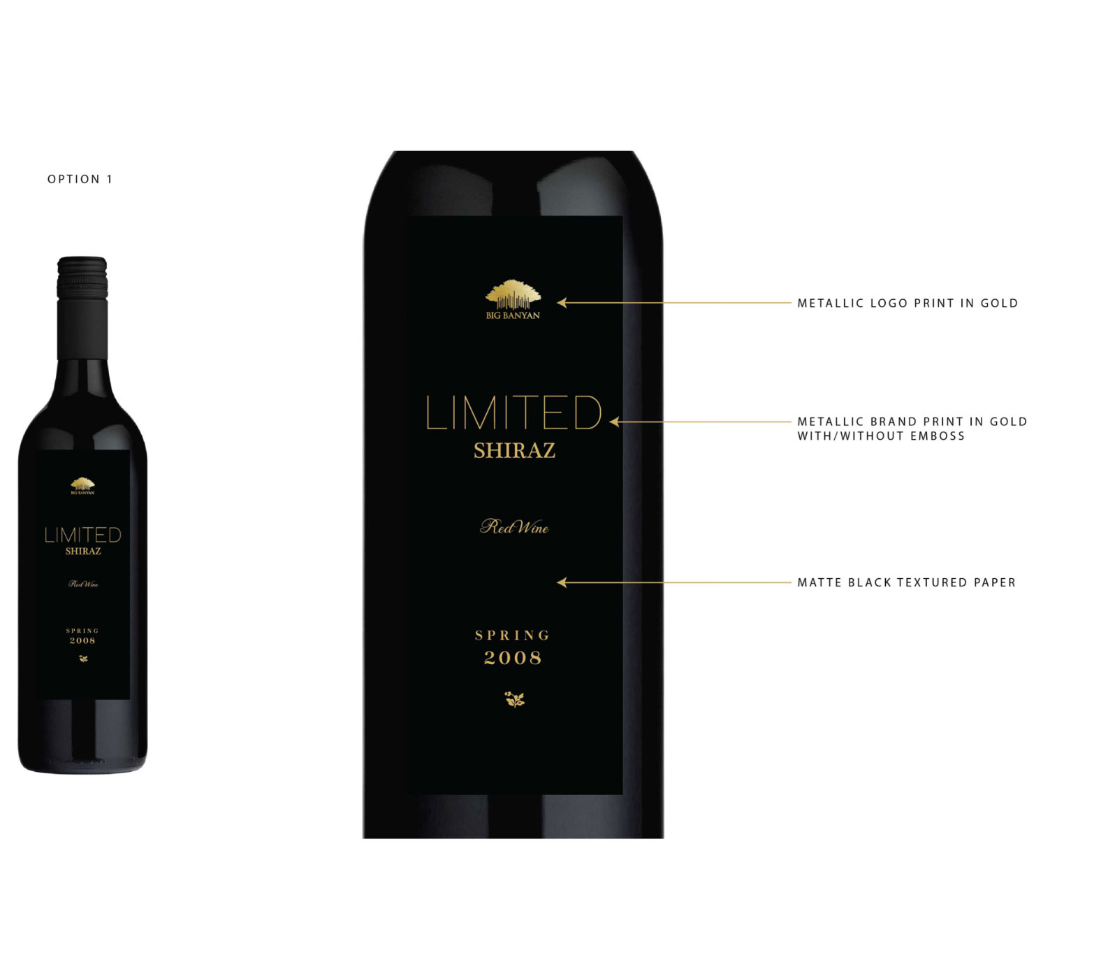
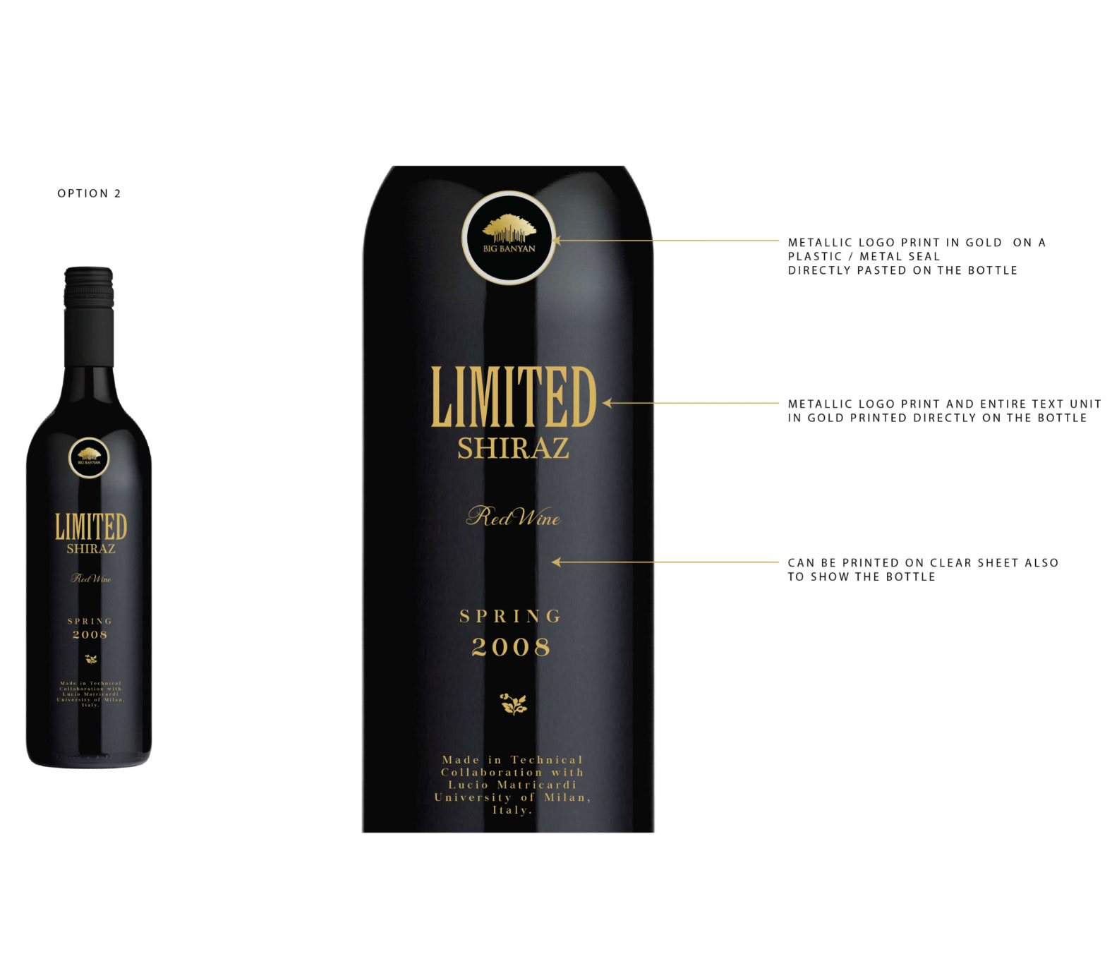
PRODUCT CENTRIC
SIMPLE ELEGANCE
MINIMAL DESIGN
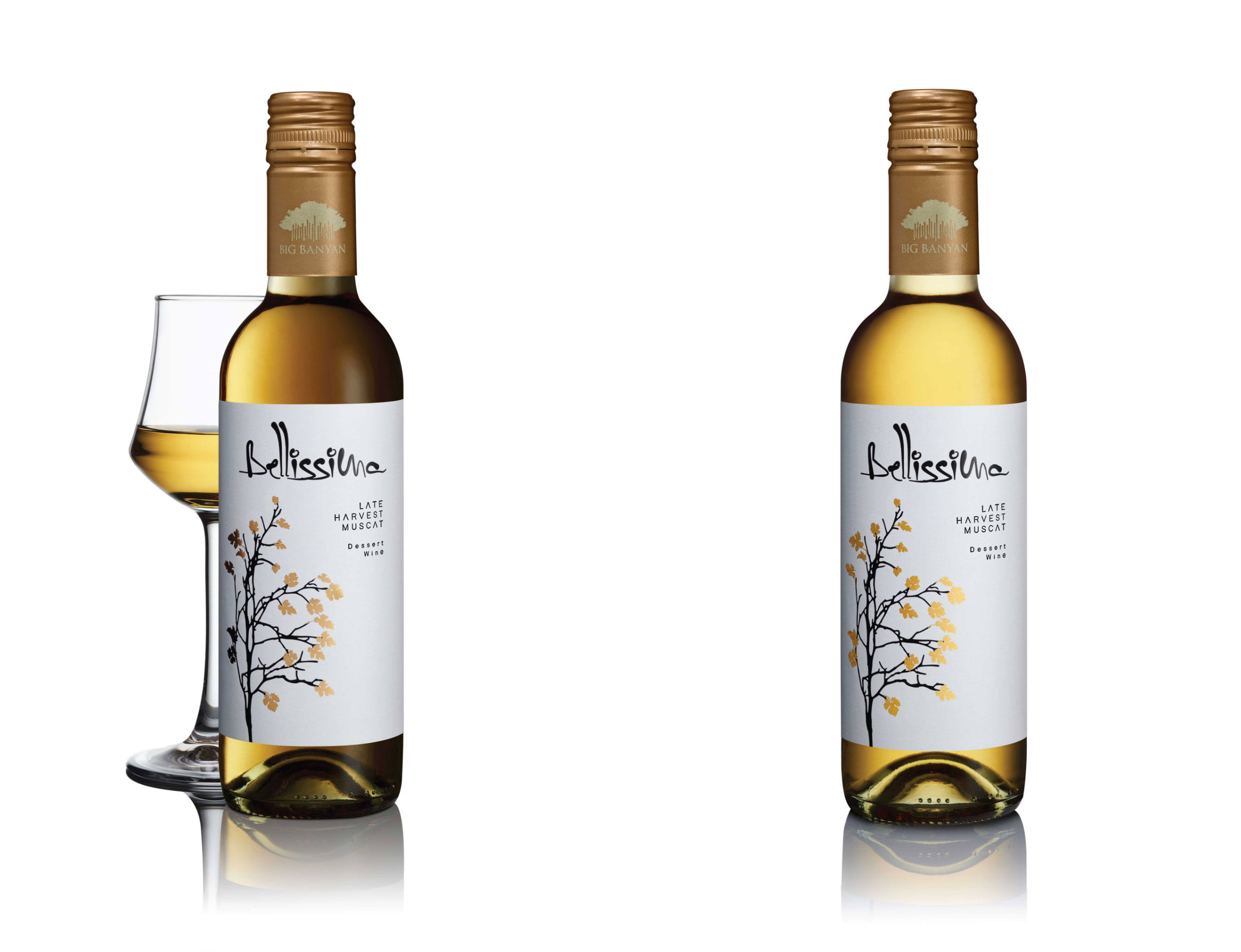
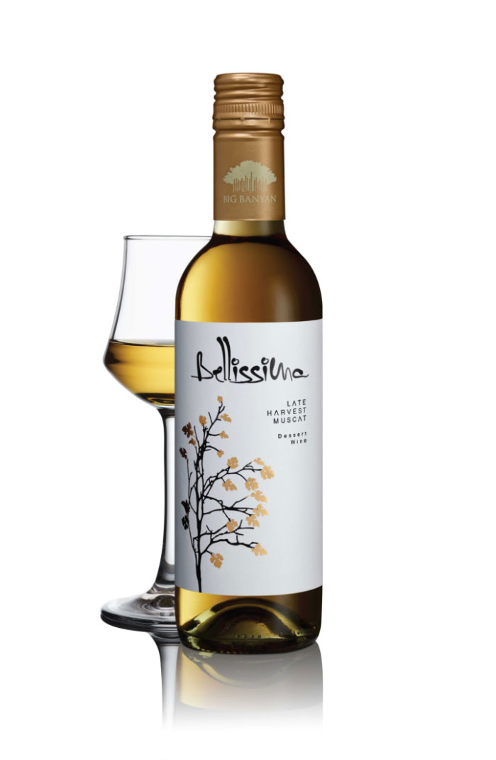
BELLISSIMA DESSERT WINE
The Result 

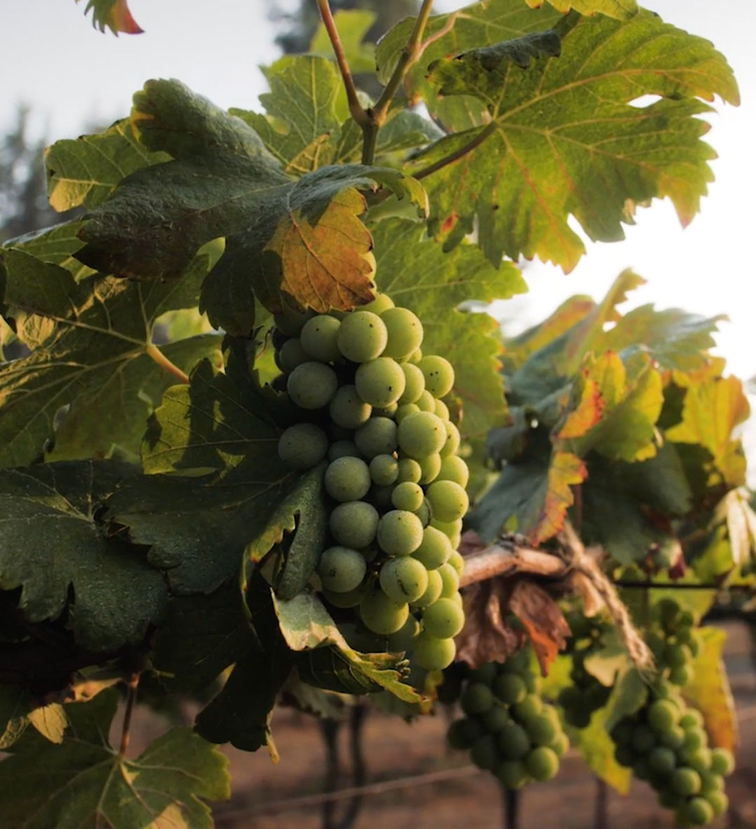
The golden hues and sweeter notes of the dessert wine needed a gentler appeal. We were inspired by the vines in their vineyard, and that took shape as the gold-leafed graphic on the packaging.
EVOCATIVE STORIES
REAL MOMENTS
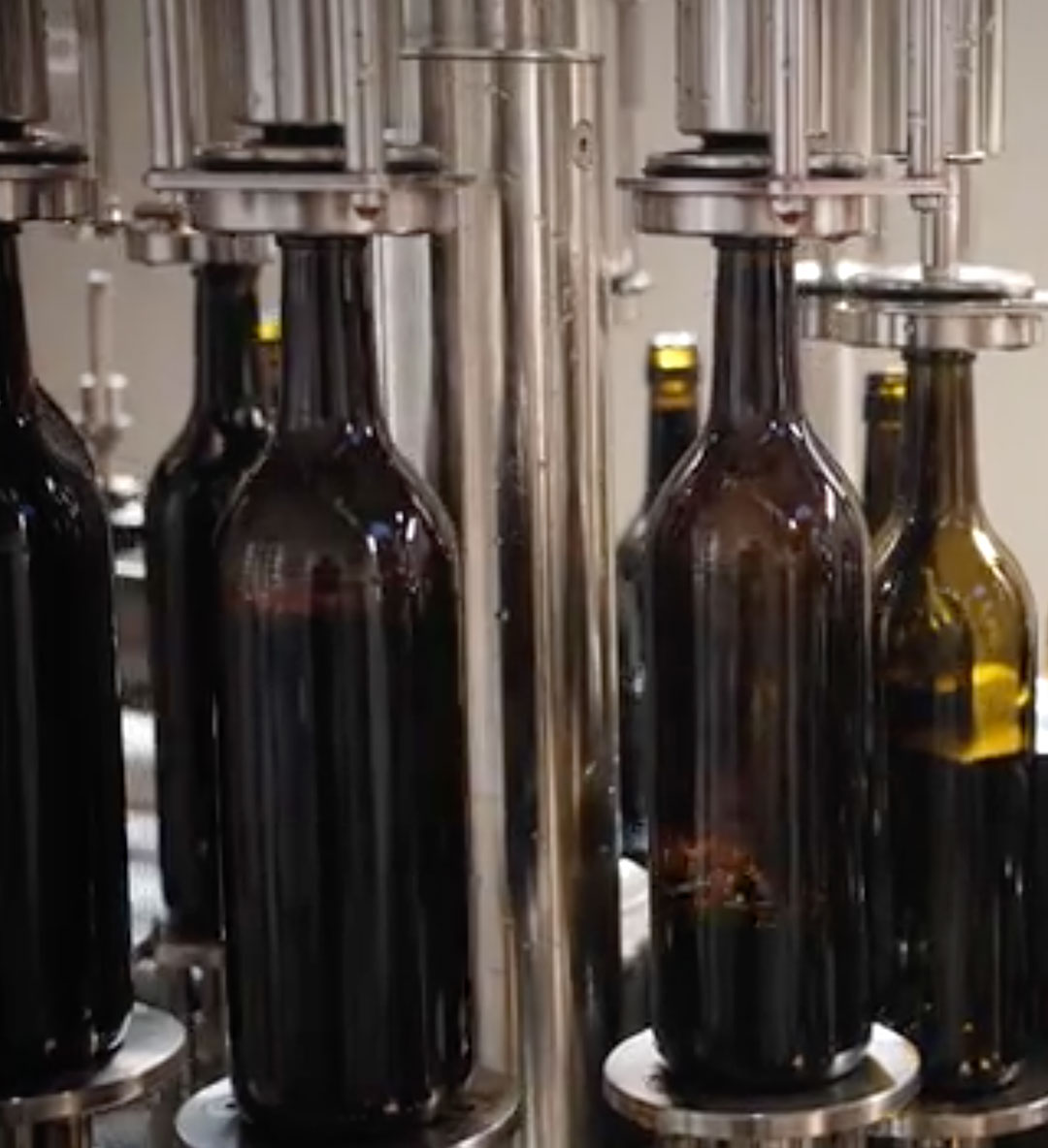
PROCESS CENTRIC


